|
Typography is the set-up of words that makes the whole thing look clear and pleasing. This is important as it sets an overall representation of what you are trying to make the viewer think.“Each font has a personality and a purpose”. means that even fonts can produce a certain vibe. The five fonts that I've learned in this lesson are serif, San serif, monospaced, script, and display. Serif has lines at the bottom of each letter and i personally think this font is quite formal and should be used in things like newspapers..etc. Sanserif is not too formal, but it's the neutral font that is used everywhere. Monospaced fonts have an equal amount of gap in between each letter of a word. The script is extremely fancy and has lots of curves on each letter, and it is very attractive. Display fonts are attention seeking, creative, and outstanding fonts that would immediately grab a person’s attention. typeface comparisonFor this assignment, I used the same word, but in many fonts. 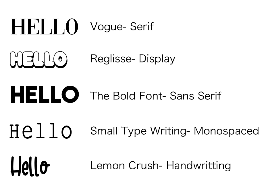 Word PortraitsIn the activity "word portraits" I used 10 different words with two words with the same font, but with opposite match. 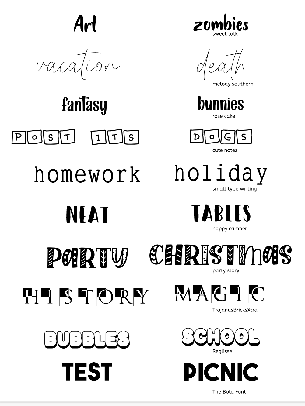
0 Comments
|
Archives
May 2021
Categories This work is licensed under a Creative Commons Attribution-NonCommercial-NoDerivatives 4.0 International License. |
